
 HandyMan and I stayed at the amazing Hotel 1898 in Barcelona on our honeymoon. This beautiful hotel, once home to the Philippine Tobacco Company, features a modern masculine decor with rustic photographs alluding to its Philippine heritage. Ever since our visit, I've wanted to replicate the look using photos I took on our trip to Asia.
So using this look as inspiration + a little Powerpoint magic, here's some ideas I've come up with for our dining room:
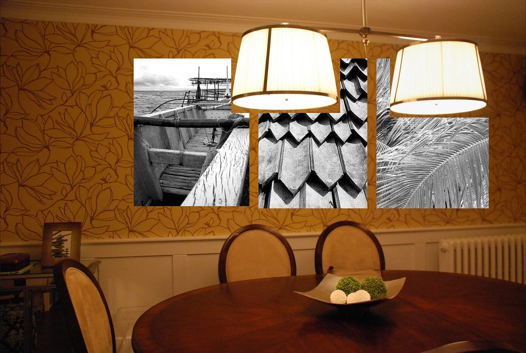
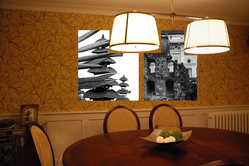
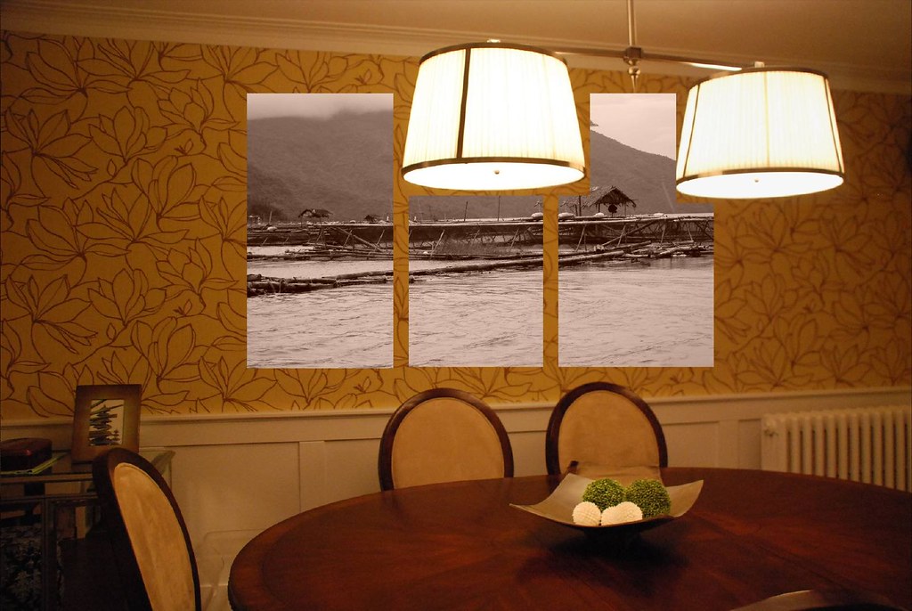
I'm liking the different textures in the first photo, and definitely like the look of three prints instead of two. Sepia also seems to work better in the room than black and white. I wish I had a real long horizontal photo like in the inspiration pic - but then, with the wainscotting, the room is looking pretty horizontal as it is and I may not want to emphasize it more. All in all though, I'm not entirely sure this photo concept works in this room. I'll have to mull it over a bit more. What do you think?
No comments:
Post a Comment