I blame it on the mommy brain.1. Remember our plans to go to the antique fair last weekend? 80km into our road trip I realized that I HAD THE WRONG WEEKEND. Oy.
2. Tara (you must visit her blog and see her lovely home!) had mentioned in the comments of my post that she frequents Southworks Antiques in Cambridge. Rather than turn around, we decided to keep driving and check it out. HandyMan, Chloe and I had visited Cambridge last summer after hearing about a great antique mall, but we couldn't find it. All we found was this outlet mall, filled with shoe stores, discount linen shops, and a place that sells socks and only socks. 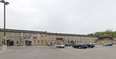 So we googled the place Tara mentioned (gotta love the iPhone) and ended up here:
 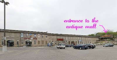 Yes, its the SAME PLACE we were at last summer. How we could miss the entrance and the 30,000 sq ft antique mall upstairs is beyond me!
But maybe things were supposed to turn out this way because we found a few little things, like these old yardsticks:
 My plan is to stack them one atop the other and affix them to a wall somewhere, maybe in the new basement, and mark Chloe's height each year.
We also found this nice mail slot: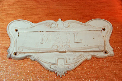
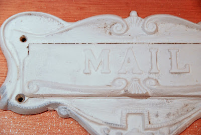 HandyMan will strip all the paint off of it, paint it black, and replace this ugly rusting thing:
 I think this used to be the milk door, where fresh bottles of milk were dropped off. Its been boarded up on the outside and a mailslot added but on the inside, we still have a little door we open to access the mail. HandyMan will probably clean up the exterior while he's at it. Our poor mailman has suffered looking at this thing long enough.
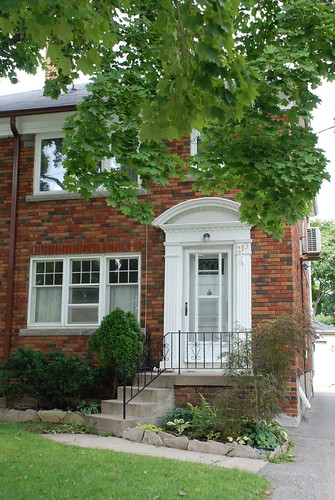
In a continuing effort to make our house stand out from the crowd, we installed our modern house numbers. They seem to be a hit with HandyMan's "groupies". [Sidenote: HandyMan has garnered quite a following among the 5- to 10-year olds girls living on our street. More than once, I'll be working somewhere in the house when I hear the girls on our back porch, asking HandyMan what he's doing in the kitchen. I guess the sight of a man wielding a powertool is attractive to females of all ages!] As one of the girls told HandyMan tonight, "I like your numbers. Everybody else's is just boring". Perfect...non-boring is just the look we're going for :)
Before and after:

We're experiencing a bit of an early summer here in Toronto. Temperatures over the last few days have hovered at a high of around 22 degrees celsius (about 76 degrees farhenheit). That means that everything outside is coming alive... our forsythia is blooming a brilliant yellow, the crocuses and daffodils are coming out, and our lawn is slowly turning from brownish to green. With all this colour and sunshine about, its making the front facade look even more worn, boring, and just plain blah.  Living in a neighbourhood with row upon row of the same red brick semi-detached houses, HandyMan and I want to put a little bit of effort in making our house stand out. We've scoped out "the competition" and noticed that (a) most people do not paint their window and door trims preferring to keep them white; (b) there is a preference for painting the door black; and (c) house numbers and light fixtures tend to be in a black finish and very traditional in style. Likely branded as the neighbourhood rebels (that reputation gained because we're the only as-yet childless couple on a street with 44 kids - that's about two per house!), you just know we're running in the opposite direction from convention.So what to do... we want a more contemporary look for the front facade. Think brushed metals, good lighting, a minimalist garden.


We've ordered these pretty fab modern house numbers from WestOn Letters. To go with it, I'm currently on the hunt for a new light sconce. Seeing as there is only about 11" from the underside of the dentil moulding and the top of the screen door, I'm limited to fairly small and compact fixtures. This Lakeland LED sconce is the top contender. The brushed nickel finish will look great with the red brick. Ooh, and I want a custom balustrade too. Something like this one.But this is where I get stuck... I've picked out the accessories but am having difficulty on the paint colour. Any suggestions for the colour of the trim and door? The screen door will be replaced by a much simpler, single glass paned one, in the same colour as the door.

Each day, as I drive up to my house, I notice how 'unnoticable' it is. It looks like all the other houses on the street (and granted, I love how the row of red-brick semis makes me feel like I live in a leafy Boston suburb), but I can't help but wish it had a bit more presence. The shutters made a bit of a difference and at least I can tell which house is mine. Once the weather turns warmer, I'll be nagging HandyMan to paint the window trims and the front door. I also want to change the house numbers to something more modern.
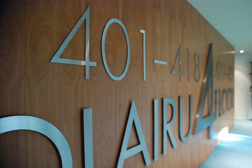
On our honeymoon, HandyMan and I stayed at the Gran Hotel Domaine Bilbao. Its a stunning place and our room literally overlooked the Guggenheim. One of my favourite things about the hotel were the numbers and lettering found throughout.


 For a font fanatic like me, I was in heaven! Each floor had lettering in a different font. Some were oversized and graphic, others were italicized and scripty. They varied in thickness too, with some floating on the wall, casting interesting shadows. This is the look I want to greet me at my door: sleek, shiny and modern. Here's a few sites I've found that offer a modern take on house numbers.
From WestOn Letters: 5" Ribbon Deep, 4" Clarendon, 3" Ribbon, 5" Futura, 10" Euro Bold.


From Atlas: Paragon Modern, Avalon Modern
 From Design Within Reach and Chiasso: Neutra, Sausalito
 With any of these, I don't think there will be any mistaking my house :)

 So we googled the place Tara mentioned (gotta love the iPhone) and ended up here:
  Yes, its the SAME PLACE we were at last summer. How we could miss the entrance and the 30,000 sq ft antique mall upstairs is beyond me!
 My plan is to stack them one atop the other and affix them to a wall somewhere, maybe in the new basement, and mark Chloe's height each year.

 I think this used to be the milk door, where fresh bottles of milk were dropped off. Its been boarded up on the outside and a mailslot added but on the inside, we still have a little door we open to access the mail. HandyMan will probably clean up the exterior while he's at it. Our poor mailman has suffered looking at this thing long enough.


