
I've always loved wallpaper. Just touching it transports me back to our house in Georgetown, with its 1970's flocked velour damask and fake wood panelling. Nothing makes a room stand out more than wallpaper. And having come from neutral toned condos, sick of the Gluckstein-esque look of everything nowadays, we knew we wanted to rebel against the sea of beige beige beige.
We started safe, venturing into our local Home Depot to check out their selection. We briefly considered a green and white damask in an enlarged pattern, a modern take on this old-world style. After some thought, we found the pattern too fussy, too 2007. We then looked at some larger floral prints. One contender was bold with cream, slate grey, and black florals. On an off-white background, it would contrast (not in a good way) with the white wainscotting so that too was a no go.
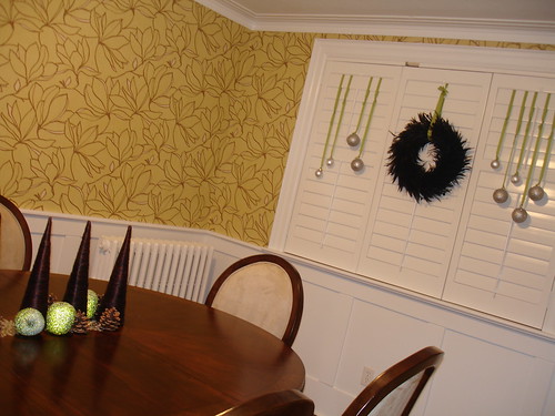
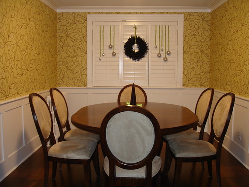
Finally, a trip to Metro Wallcoverings brought us the answers we were seeking. We decided on a pattern that was graphic and modern, colourful and young. It is a bold floral that sits somewhere between Asian contemporary and British colonial...perfect!


No comments:
Post a Comment