.:[Double Click To][Close]:.
Get paid To Promote 
at any Location


Showing posts with label drawings and plans. Show all posts

Sunday, March 6, 2011

Laying Out The Living Room

When we're designing a room, HandyMan and I like to get a visual on things before we start building. So before we started building the frame for the fireplace, we did this:


Yes, that's a dirty dropcloth stapled up to mimic what our fireplace is going to look like. I photoshopped in the fireplace location for full effect ;) Seeing things visually really helps us decide if we want to make any changes before we lift a hammer. In this case, the mockup confirmed to us that yes, indeed, fireplaces are big (ha!). Its not a typical location for a fireplace, but we were constrained by the location of the existing chimney (its above that piece of wood stuck to the ceiling). We decided on a flush to the wall fireplace as opposed to an angled fireplace in order to save on floor space.

Once we confirmed that we wanted the fireplace in this location, HandyMan started building the frame. I, in the meantime, started thinking about the rest of the furnishings. Using SketchUp, I came up with a few layout options.

Option A: 


And Option B:


HandyMan created the plan in SketchUp and I added in the decor. Once you get the hang of the program, its not too difficult - figuring out how to rotate things in 3D is a pain though! Its really great for giving you different perspectives, like this view from the dining room:


Which do you like better? Have you tried SketchUp? Now that I know generally my layout options, I can start buying some of the furniture pieces we still need.

Wednesday, November 10, 2010

The Basement Plan...For Now

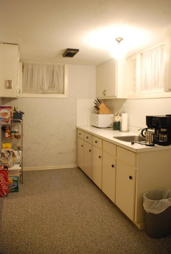
We're getting ready to start on the basement soon. I know, its been a while since I first mentioned the basement reno... but these things take time... not to mention it takes a really long time for me and HandyMan to decide on a layout... and we're still tweaking it.


So here is where we're at. Its a bit different from 
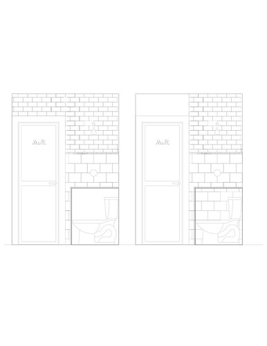
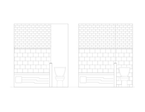
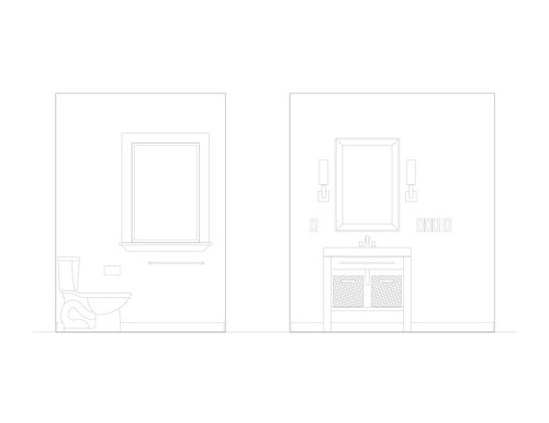
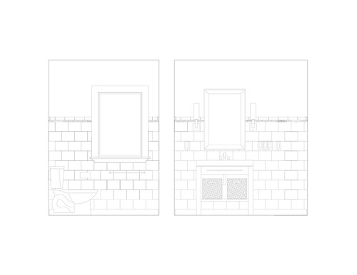
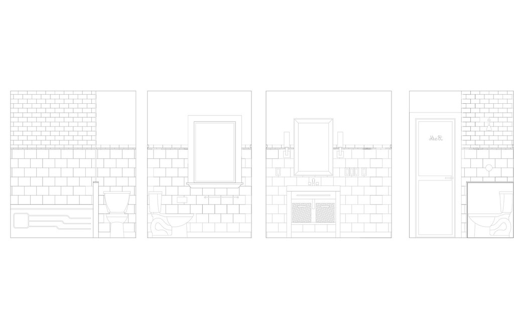
the last layout options I showed you. The upper part of the plan hasn't changed much from what we have existing. The bathroom footprint stays the same but we will be redoing all the finishes - tile, flooring, fixtures, paint. The large laundry room will now essentially be made into two rooms - (1) an unfinished storage area, and (2) a smaller but more functional laundry room with wall to wall cabinetry and lots of counterspace.

The lower part of the plan is where all the fun stuff happens. We're taking out the wall that separates the craft area and the entertainment area to create one big space. In the craft area, I'm envisioning a few floor to ceiling pantries and a long countertop. One of the "tweaks" we still have to decide is where to put the workstation. We may put it in the bottom left corner, have the countertop drop to desk height, wrap the corner, and then drop again down to banquette height.

The banquette across the whole southern wall is my new favourite feature of the room. I really wanted a craft table, but with four chairs, plus the workstation plus Chloe's play area all in the same vicinity, space was getting really tight. So, we've incorporated a long banquette - the banquette adds storage, does double duty providing seating around the craft table, and gives Chloe a great place to lie down and read a book. The craft table will also be on casters so it can be moved out of the way as needed, further opening up the space.

I think space planning is the hardest thing to get right. The basement isn't a huge space so to fit in all of our "must haves" was a challenge. I wish Chloe's play area could be larger, but then that would leave no dedicated space for crafts. And I'm thinking as she gets older, we'll want more room for painting and craftmaking and sewing, right? Tell me the truth moms. More room for dress up and play kitchen and toys - or more room for drawing and creating?

So this is the "dream plan". We still have to price out all that cabinetry for the craft area... and it doesn't help that I fell in love all over again with the Martha Stewart cabinets when I saw them at my local Home Depot... so who knows, my plans for 10 long narrow stacked drawers to store fabrics and paint pots and wrapping paper and a 10' long banquette may turn to dust when we realize all we can afford is a 2' long bench and a pot drawer!

Sunday, July 11, 2010

Faking It...

...the laundry room, that is. HandyMan and I are still pondering the basement design. We thought we were close to figuring out the layout weeks ago, but the pantry turned out to be too small and as some of you pointed out, we may want to have our food storage away from the furnace. Back to the drawing board we went.

We're close now and have pretty much narrowed it down to one layout option but we still had problems visualizing the space. So what can you do in that case except tape it out on the floor and use a bedsheet and duvet to simulate the walls.


That's the area for the washer, dryer, and bar-sized sink to the left there. Glamourous, no?

Its funny, we must have drawn up about 15 different options. After really thinking through the space and the merits of each plan, the one we're going to go with is the simplest of them all. We're basically dividing our existing laundry room/storage area into two rooms. And apart from taking out another wall to open up space, most everything else stays the same.


I know what you're thinking. I asked myself the same question - why bother renovating at all then? We could surely make the space more livable by making just some cosmetic decorating changes. Well, even with redecorating we'd have a lack of storage space and we wouldn't have a finished laundry room. The more I looked at photos of laundry rooms, the more I wanted a nice, clean space with a finished ceiling, new drywall, and plenty of counterspace. But I had to see it taped out first because even though logically the new plan gives us more usuable and functional laundry space, the current space is bigger; we're actually going to have a smaller laundry room. We needed to make sure small wasn't too small, you know?

And it isn't so all we've got to do is draw it all up, figure out furniture and built-in placement, and do the electrical plan. Then we can finally get this show on the road!

Tuesday, May 18, 2010

The Basement: Layout Options

HandyMan and I have been sketching out ideas for the basement layout for weeks now and we've come up with some interesting options. Here's what the space looks like currently:


When we first started thinking about the space, we focused on our top priorities: more counterspace in the laundry room, and creating a pantry. In this option below, we shifted things around in the laundry room (which is currently too big) and made room for more storage closets and a nice big u-shaped pantry room. HandyMan likes niches and alcoves so he placed the pantry in such a way that it created a little niche for a workstation on the other side of the wall of the furnace. Niches like this really maximize the use of the space and create nice clean lines in the layout. He made use of another small niche (to the left of the laundry room door) to put a storage closet for detergents and such.


Building on this first option, we thought - what if we move the hot water tank to the laundry room so that all the ugly but necessary mechanical stuff gets put in one room? And what about creating a separate, more contained work area in the rec room?


Hmm, its not really working is it. The pantry seems to be floating in space. Then we thought - what if we change the entry... make the work area more of a pass-through hallway type of layout?


Okay, that plan is a little better looking. But now the pantry room has completely disappeared! Time for some radical thinking... what if we moved the laundry to the current kitchenette area? This would leave room for a really big pantry/storage room. And we could have a small-ish work/crafting room with a lower kid-sized table beside it.


I'm liking where this is going... but still not quite there. More radical thinking required! What if we stripped the laundry room down to the bare bones and created a small but functional space? And moving the placement of the pantry room... does this help?


Not really. While the bottom half of the layout seems nice and open, the top is a jumble of rooms and doorways. At this point, we took a step back and had a few "lightbulb" moments which helped us create the more streamlined plan below:


First, we decided that the pantry could be an unfinished space, meaning it could just be a bunch of shelves and brackets. It didn't even need to be drywalled or have a finished ceiling. With that in mind, we then thought - well, why don't we put the ugly hot water tank and furnace in the pantry room them? Doing this then created the opportunity for a more streamlined, rectangular shaped laundry room. That meant we could have nice long runs of countertop along the walls!

Another lightbulb moment came when we thought - why don't we change the storage niche that was to the left of the laundry room door and instead move it outside of the laundry room and change it to display space? Then we could create a nice little circulation space - display shelves on the left, laundry door in front, pantry door on the right, and a nice potlight overhead? Having the doors all in one zone makes sense and having visible open shelves creates some interest and texture.

Sweet! Can you see how those few changes has led to a more pleasant, logical and efficient plan? Architects call those lightbulb moments "unlocking the plan". I call it just plain awesome :)


So here's the final plan (I think). I'll be sharing the 3D model HandyMan created in SketchUp so you'll get a better idea of what this plan really feels like.

Thursday, May 6, 2010

The Basement: Design Tools

When HandyMan and I start planning a room, we start by drawing and drawing and drawing. On the backs of envelopes, restaurant napkins, notebooks, old telephone bills, whatever scrap piece of paper is nearby soon becomes filled with our doodles. At some point though, we put those sketches into some electronic form so we can get a sense of space and style. There's nothing that helps to visualize a room better than a plan drawn to scale or a 3D version that you can move and twist about to get perspective.

Usually, the first tool of choice in our design toolkit is
AutoCAD, but that's only because HandyMan uses it every day in his day job and is very familiar with it. Its pretty nifty though for drawing up floor plans or elevations and adding in elements of a room like fixtures, furniture, and tile. It was really helpful when we were deciding on the tile pattern for the bathroom.


For getting perspectives though and 'walking' through a plan, we needed something with better 3D capabilities. Enter Google SketchUp. Free and easy to use, SketchUp helps you build 3D models and share them. There are tons of tutorials to help you and an online warehouse where you can search and use models others have created. Its also easy to populate your models with typical layouts (e.g L-shaped kitchen) or furniture (Ikea Expedit, anyone?) because somebody somewhere has already created the object in SketchUp. Here's a few perspectives of the basement that HandyMan created after using SketchUp for the very first time:


Pretty cool, eh? When you're planning a large space or multiple rooms, Google SketchUp is really useful. You can do things like add textures and colour, remove parts of the model (like exterior walls), and swoop in like a bird and see your plan up close.

Once we have the plan finalized, we then work on the finer details and decide on the look of room. I like to create mood or inspiration boards and put together images that help convey the style and feeling I want. You can use Photoshop if you have it (Making It Lovely does great inspiration boards) or use Polyvore, a free tool which even saves the online links to the items you put on your mood board. It worked great when I was trying out looks for the kitchen like this one:

and this one:


So that's what's in our DIY design toolkit. Can you tell we like to plan things out before we build? I'll be sharing some of our plans with you in future posts and illustrate how good planning really does help you design better.

Tuesday, May 4, 2010

The Basement: Making the Wish List

HandyMan and I have started to think a bit more seriously about the basement renovation. Similar houses in the neighbourhood have recently sold for 40% (gulp!) more than we paid 2.5 years ago and we know we need to have a finished basement in order to get top dollar if and when we sell. And with the little one taking her first steps now, she could definitely use the room to run about and play! I thought you guys might like to see the thought process we go through so I'll be posting about the basement, starting with the design through to demo, picking materials, and final finishing. I'll be honest, we're not moving as fast as we used to so this will be a loooooong process ;)

First up: the wish list.

The basement in its current state is livable (but ugly and inefficient and dark). Luckily, our ceilings are about 7' so we won't need to dig down. The walls are textured and accented in a splattered paint technique and the floors are covered in a rough carpet. We have a large laundry room, an adequate bathroom, a kitchenette that we have no use for, and a rec room that's on the small side. There is also a step up into the rec room and we have no idea why the floor is raised. I'm just hoping we don't find another mouse-house like we found in the kitchen!

You can see the original floor plan here.

So what do we want to do to this basement? Here's a few things on our wish list:

- countertops in the laundry room for folding
- additional storage for off-season clothing
- pantry for storing canned goods
- work space (we'll be moving the home office to the basement)
- an area for crafting/sewing
- play area
- space for Chloe to run about
- maximum use of natural light
- redecorated bathroom
- heated floor in the bathroom
- TV/entertainment area
- consistent flooring
- open plan

Hopefully we'll be able to transform the space into something we love and a place we love spending time in. Anything else you would add to the wish list?

Monday, April 26, 2010

Add It To The List


What's this? We want to renovate the basement?? Oh boy.

Wednesday, January 13, 2010

Master Bedroom: Making A Focal Point

And so it begins. We've started, ever so slowly, on the renovation of our bedroom. Given our post-baby track record, we'll probably finish this project up, oh, when Chloe graduates from high school :o\


So here is the bedroom in its current state. *Shudder* I know, I know, shocking isn't it? Sad to say that we've lived in this sorry state of a room since we bought the house. While we have finished many other renovations in the house, we've neglected one of the most used rooms. Don't ask me why. That's just how we roll. Amazing how we don't even noticed the floral wallpaper border or fugly blue curtains anymore! But, no worries, because this room will soon be transformed. (And anyway, a really bad Before photo makes the After even better ;) ).

I thought you all might like to see how we HandyLuster's put a room together, so I'll be doing a series of posts on things like layout, lighting, fabric and paint selection for the room. First up, focal point.

The pic above is from the door when you enter the room. I wanted the room to have instant impact, which meant the wall facing the door should be the focal point. However, that bump-out in the wall limited where we could place furniture. So, we've gotten rid of it by framing out a wall around it, leaving us with a nice flat wall and clean slate to work with.

If you notice, we always try to add a bit of architectural interest in each of our rooms, like the window seat and built-in storage in the nursery, or the wainscotting in the dining room. In this vein, for the master bedroom, we decided on panelling for the wall. Chris at Just Beachy wrote a great post on this and I was inspired to do a few mock ups in photoshop. Here are a few options I came up with:


We'll be putting sconces on either side of the headboard and hanging a chandelier, so that had some impact on the placement of the panels. As with all of our designs, we were going for something not too traditional and not too contemporary. We're working with our existing modern espresso headboard and the new sidetables. As well, we have to design the room for without the crib (don't ask me when Chloe is moving out though because I don't know, lol).
I mixed and matched some of the elements to come up with a final design. I liked how the sconces sat on the vertical panels. I also liked the different sized panels... I just felt a regular grid would feel too modern. So once we decided on the look, HandyMan did up a plan to scale in Autocad and we came up with this:

We needed this plan because we had our electrician (hi Mike!) come in last weekend and put in potlights and plugs and boxes and switches. Had I been a bit more on the ball, I would have picked out the actual sconces and ensured they were the appropriate distance from the headboard and the side tables. But we didn't (I guess finishing the panel design at 2am the day before Mike arrived at 8:30am didn't help!) so cross your fingers we can actually reach the lights while lying in bed.

So those are a few of the things we thought about before we even lifted a hammer. More posts to come.

Sunday, November 9, 2008

Bathroom Layout

Ever notice how when you're working on something fun, it doesn't seem like work? That's how HandyMan is with AutoCAD. Task him with drawing something up and he becomes as productive as a spider making its web. He can whip up plans, elevations, and drawings in no time. So when we found the tile for the bathroom walls, he got really excited and came up with myriad options. Which was great, because sometimes having a visual of the end product really helps with the planning.

At first, we thought of having the tile just on the tub walls and put a half wall of beadboard on the other walls. But with the carpet tiles in marble, we thought that would be mixing styles too much. So then we played with the idea of putting tile on two of the four walls... but where to stop? Put the tile only in the shower stall? Run the tile across the top of the door and behind the toilet? Here are some looks:
Okay, looking good so far. And what about the other two walls? It would be easy just to paint them and be done with it. Or we could tile them which would be a little more work. Maybe tile only half the wall to keep from overwhelming the small space...

So many choices! But now seeing it all on paper, we can clearly see the look we want. Here it is:

I love the vintage feel of the room. Using white tiles will help keep the room from feeling too tight and claustrophobic. The band of grey ceramic tiles beneath the cap rail will run around the perimeter of the room and will help tie everything together. As well, we're going to wrap the top and front of the half wall between the tub and toilet with marble, which ties in with the marble tiles on the floor. And the half frosted/half wood door will bring in natural light and brighten up the space.

There's a few things we're not loving (like the front skirt of the tub - would have looked better plain and simple), but at least we've managed to find fixtures to fit in the small space. I'll post pics of what we've picked out so far soon.

Monday, November 3, 2008

Tile This, Tile That

Not much progress on the bathroom reno.  We've had two contractors in and are just waiting for the quotes to come back.  I'm still hoping for a late November start.  By the looks of it, the contractors will have their work done in less than a week.  That leaves ample time for HandyMan to do the tile work after, and still have time to move onto the guest bedroom before the baby arrives.  Speaking of baby, we're at almost 17 weeks and everything is going fairly smoothly (minus the nausea which seems to stick around most of the day :o\ ).

HandyMan came up with a few floor tile options.  We're going with a basketweave tile carpet, not hexagon tiles as shown, but you get the picture.  The toilet will go in the niche at the top right.  If you look closely, you can see the dashed lines which indicate where the new vanity will be placed.

Options 2 and 3 show the carpet off nicely; the tub and carpet line up and will look pleasing visually.  Option 2 has the remaining tile in an offset brick pattern.  With Option 3, the other tiles are in a grid pattern.  Neither of these really appeals to me... the mishmash of grout lines seem chaotic.

Option 1 is what we're planning to go with. Stretching the tile carpet the full length of the room will make the overall space seem bigger.  And since the vanity will have an open slat shelf on the bottom, you'll be able to see through the vanity to the floor.  Keeping the brick pattern of the remaining tiles to just the toilet area will also minimize the visual clutter.  Now all we have to do is tear out the bathroom, move the plumbing, buy the fixtures, buy the tiles, and put everything back in.  Easy as done  :oP

Friday, April 11, 2008

Aya want a nice kitchen

As it turns out, we won’t be going with the Lowe’s cabinets after all. Our electrical quote came in much lower than expected, the bin rental was also lower than our estimate, which meant getting the Aya Kitchen was back in consideration. We did flipflop on this one… Aya doors looked and felt nicer, had nice hardware, but the upgraded Lowes cabinets were plywood construction with dovetail joints. Lowes was also cheaper but we’d have to take care of the extras (like glass doors) whereas Aya was all in one and the price difference now wasn't that great. Seeing the great Aya kitchen at Junebug & Frisco’s place helped seal the deal. In the end, we decided to go with the Aya.

So here is the revised kitchen plan which is a little different from the Ikea plan mockup I put together. Let’s take a tour.


This is the west kitchen wall. The leftmost cabinets are the new workstation. We used to have a narrow pantry there but two days ago, but thanks to HandyMan’s handy skills, that is now gone and this new space is framed in. We’ll put cookbooks in the open shelf along with an iPod docking station with wireless speakers. We’re not big audiophiles and figure we can just move the speakers from the kitchen to the living room if needed. Below the uppers, we’ll have a wall-mounted flat screen TV on an articulating arm. The lower cabinets will house the bigger appliances – KitchenAid stand mixer, blender, George Forman grill etc. To the left of this workstation, on the wall leading down the hallway, we’ll be putting a full-length chalkboard. It’ll be framed out in the same Shaker style as the cabinets and will have a strip of hooks mounted on top to hold keys (the side entrance enters right near this chalkboard). I really wanted to have a hidden cabinet behind the chalkboard, but the studs are too close together at that point, so this is the best solution.

The doorway leads into the dining room. To the right of the doorway, we have storage galore. Lots of deep pot drawers and uppers! Around the range, we’ve got a pull-out spice rack on the left and narrow cabinet for cookie sheets on the right. Since the stove is being moved from the other wall, HandyMan will have to run the air vent through the ceiling and out to a new hole through the exterior brick. Hole in brick? Yikes! The run of cabinets stop short of the sliding glass doors on the north end of the room. You can see our whole kitchen from the back deck (which really creeps me out sometimes), so I may put some drapes in front of the sliders.


On the east kitchen wall, we’ve got a full-height pantry on the left with a mix of fixed and pull out-shelves. Beside that is the counter-depth French-door fridge. In the base cabinets, we’ve got a pull-out with two metal shelves (to house baking supplies, rice, bulky items etc); dishwasher, a pull-out recycling drawer, and a bank of drawers. If we had put the dishwasher on the right of the sink, we’d have room to widen the metal shelves enough for them to store the KitchenAid… but that would mean the dishwasher was visible from the dining room. Not good. So, we’ll live with this setup and I’ll have to crouch below the workstation to get the KitchenAid for those once-in-a-blue moons when I do some baking. The uppers on either side of the window all have glass fronts and will keep this wall of cabinets from feeling heavy. I’m thinking we paint the back of the cabinets, maybe a pale yellow to tie in with the dining room, and to make my white dishes pop.

To finish off the room, we’ll have a roman blind shade on the window, a hanging schoolhouse mini-pendant over the sink, 4 recessed pots, and a fresh clean palette of white, grey, touches of yellow, and black. We're pretty happy with the layout of our tiny galley kitchen. Anything we've forgotten?